The 6 characteristics
of a good logo
The word “logotype”, or “logo”, comes from the Greek word “logos”, which signifies speech or discourse. A logo symbolises an identity. It carries a company or project’s values as seen by its public. It is essential! But what are the characteristics of a good logo? Agent Majeur can give you some answers.
![]()
A good logo is unique
It specifically illustrates the activity, products or services of your company and makes the connection with your consumers or clients. It reflects your identity, distinguishes itself from other company logos and, of course, it avoids confusion, particularly with the logos of competitors.
A good logo speaks on its own
Its significance is clear and jumps out at you. Your logo carries the message of your business. It embodies your values and immediately translates your world.
A good logo is simple
It is easy-to-read and approachable. It can be understood straight away, in the blink of an eye. It isn’t complex and does not aim to say everything about your company’s activity because, at the end of the day, it is only the first element of your visual identity.
A good logo is memorable
It is easy to remember, recognise and associate it with your company, even if there is no lettering associated with the logotype. Bear in mind however that, in humans, colour perception is immediate. It happens before shape recognition and reading of text.
A good logo is flexible
It is functional and can be used on your different communication materials: paperwork, website, accessories and signage. It is readable and understandable in all circumstances, even when it is displayed in a small format or in black and white.
A good logo is durable
It is timeless and resistant to changing eras. A good logo doesn’t follow a trend so doesn’t need to change every day. Whilst it is well thought out, it will only need revision, or refreshing, after a good few years of use.
Also, don’t forget…
… a good logo is attractive, inspired, stands out and makes an impact! It incites desire in your public, consumers, clients, funders or partners. And it is for this reason that you need to take care of it.
An example of a good logo
Amongst some of the most successful logos is that of EDF. Behind this logo, some people will see a mill, wind turbine, sun or flower, others may imagine a stick figure walking towards the right, towards the future. The shape fits that of a circle, symbolising evolution, movement and fullness. This logo expresses the activities, values and objectives of the company, such as developing eco-friendly energy.
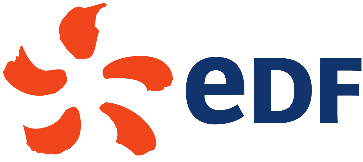
Regarding the colours used, they are also meaningful. Orange evokes receptiveness, abundance, and blue represents tranquillity, satisfaction, freshness and big open spaces. By the way, have you noticed that only the first letter of EDF is written in lower case? It’s a reference to the electron, the basic building block of electricity.
Feeling a lack of inspiration? The graphic designers at Agent Majeur can provide you with some fresh eyes on your activity, help you to pull out the key ideas and transpose them into a logo with a creative flair… Contact us!
> Graphic design
10/10/2016