Communicate
your data
Stephen Few has been a data design consultant and trainer for 20 years. Founder of the firm Perceptual Edge in California, he wrote ‘Show Me the Numbers’, a book in which he explains how to use tables and graphs to achieve successful data communication.

Agent Majeur: What are the specificities of quantitative communication?
Stephen Few: First of all, to be effective, quantative data communication involves the same practices that produce effective communication in general. For example, we should express ourselves in simple and clear terms that are familiar to our audience. Using a specialized graph that no one in our audience understands leads nowhere. Quantitative data describes amounts, values. It can always be communicated visually. In fact, many aspects of quantitative information can only be understood if presented visually.
For example, words cannot adequately describe trends through time. Even a series of numbers in a table, such as one for each month of the year, cannot describe a trend in a clear way.
To clearly understand a trend, we must be able to see it. For this reason, visual representations of quantitative information in graphs are often the only form of communication that works.
When do you recommend using tables?
Tables are useful, but only for specific purposes. Since data are organized into columns and rows, alphabetically or chronologically, a table makes it possible to find easily and quickly particular values in a series of data.
Another great strength of tables of numbers is their ability to provide precise values. If a 10-decimal precision number is needed, we can show that precision in a table. Graphical representations of data cannot show such a high level of precision.
When is it better to use graphs?
Graphs should be favored in the following cases: to identify evolutions and trends, highlight unusual values, compare one series of values to another, and visualize a great deal of quantitative information rapidly.
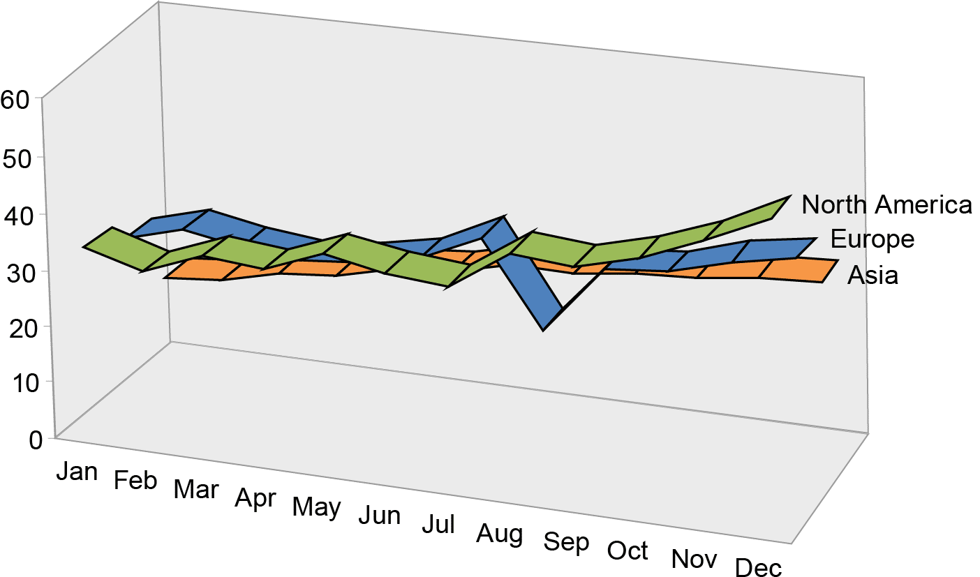
What do you think about 3D graph displays?
Three-dimensional graphic display of quantitative data is useless, unless the third dimension represents data. In the graph below, the lines are 3D, but their depth doesn’t mean anything—it is mere decoration:

The second graph shows the same information displayed in 2D:
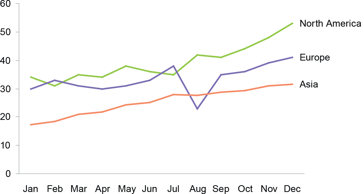

It is obvious that the 2D graphs make it easier to see and compare these data. A meaningless 3rd dimension hinders communication, because it adds complications or distraction.
What are some of the best ways to highlight what is important?
When we show data and we have a message to convey, it is often the case that some information is more important than other. When it is the case, we should emphasize this piece of information by making it stand out visually. There are a number of ways to do this involving various visual attributes. In the example below, the line representing Europe is emphasized by making it darker than others and the other lines are diminished thanks to the use of lighter colors.

Another way of highlighting this information is to make the line representing Europe thicker than others. In terms of quantitative data communication, what is most important to remember is that we should always clearly know what we want to say, and then, design a display to support our message.