Our scientific poster test
in 8 questions
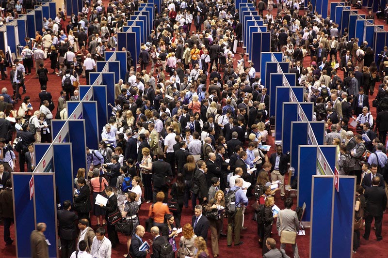
A scientific poster should above all be attractive to achieve its objectives. First off, we seek to stimulate interest, spark curiosity, catch the attention of the public. Visitors are free to move around unlike in oral presentations, during which they are part of a captive audience. To help you to assess the attractivity of your poster, Agent Majeur concocted a test in 8 questions.
Is your scientific poster attractive? Doing this test will only require 1 to 2 minutes. Place yourself in front of your poster and answer these 8 questions.
General appearance
0 – Messy or cluttered.
1 – Nice to look at. Good use of colors, graphics and text.
Use of white space
0 – Very little. Concentration of texts and graphics.
1 – The poster sections are well separated.
Text / pictures balance
0 – Too much or not enough text.
1 – Good balance. The texts and graphics are well spread across the poster. There is enough text to understand the graphics.
Text size
0 – Too small to be legible from 1.5 m, including captions and pictures.
1 – Easily legible from 1.5 m.
Layout
0 – We don’t know how to look at the poster.
1 – The various poster sections can be easily spotted thanks to the titles.
Title
0 – Unclear to non-specialists.
1 – Identifies the topic and sums up the message.
Author identification
0 – Absent.
1 – Present: it specifies the author’s name and contact info (mail, e-mail…).
Research objectives
0 – Absent.
1 – Present and easy to spot.
Your total is 8 points? Congratulations, your poster is attractive and people want to read it! If you are short on a few points, here is an overview of the elements you should take in consideration to stand out.
For starters, you should particularly pay attention to your title. At one glance, the viewer should be able to identify the subject. The title must be emphasized on the poster to be read from a distance.
Next, work on the visual impact of your scientific poster. Use images, graphs or photos. A poster overloaded with text is unattractive. Including one or two high-quality images always attracts attention.
Finally, use a simple graphic design, limit yourself to 3 colours in addition to black which is used for text. Keep in mind that all the content presented in a poster should be organized differently from written information. Discomfort (standing position) and reading time (often short) should be considered.
A good scientific poster should not only be attractive. It is important to make it clear, structured, concise…Therefore, we invite you to discover detailed tips on how to improve both the content and appearance of your scientific posters.