Graphical abstracts:
follow our guide!
“Science is not finished until it is communicated”. This famous quote from Mark Walport is well known by researchers and science communication professionals. It so happens that a new way of communicating about research is gaining in popularity. Graphical abstracts are a new type of scientific illustrations. Whether they are optional, strongly recommended or mandatory, graphical abstracts are starting to be used in many scientific fields. You won’t be able to avoid making them much longer. So, what are graphical abstracts and how can you create a striking illustration? No need to panic, we explain it all in this article!
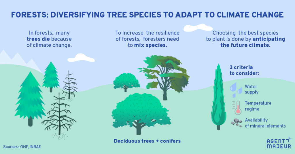
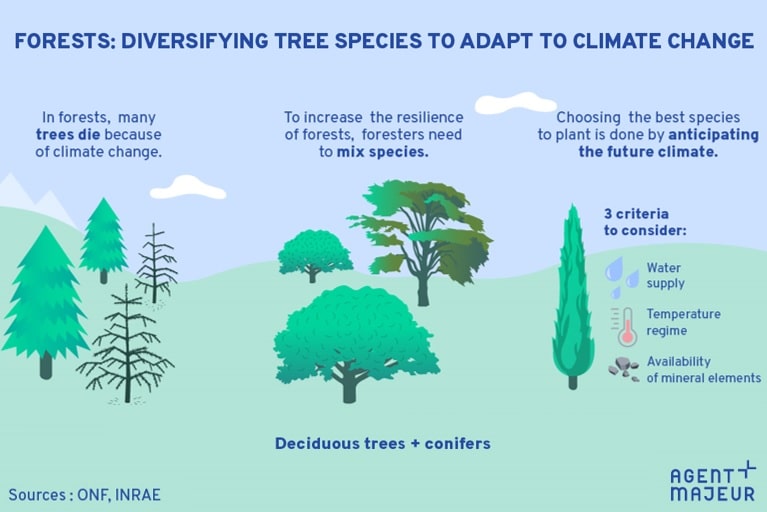
A graphical abstract example used to communicate on LinkedIn
In 2021, across all fields of science, 4.6 million papers were published worldwide, according to the Scimago Journal & Country Rank. In this competitive race, the United-States comes second and the United Kingdom ranks fourth, with 649,063 and 219,625 published papers in a single year, respectively. In light of the ever-increasing number of articles in the literature, how can scientists promote their research and follow scientific developments in their field? Graphical abstracts make it possible to stand out in this mass of knowledge.
An image to promote research
As their name suggests, graphical abstracts are a visual summary of the outcomes of a research project presented as an image. This type of illustration is very attractive and has two objectives. First, it allows authors to share and promote their research. Graphical abstracts are usually submitted with a , but they can also be used to communicate on social networks in order to attract readers.
Furthermore, graphical abstracts make it easier to keep track of scientific advances. These images can help researchers to identify relevant articles for their research more quickly. They can also be designed to target a wider audience or to promote interdisciplinary research.
New illustration, new challenge
A graphical abstract should enable the target audience to understand the main message and highlights of a study, in a synthetic and visual way. The illustration needs to be understood at just one glance, without reading the text. Do not take an existing figure from one of your research papers, it will be hard to grasp out of its context. Likewise, you should not copy all the information from the written abstract of your scientific paper in an image. You need to create a new illustration in its own right and select the information you want to share.
A difficult but necessary choice
According to Antoine de Saint-Exupéry: “Perfection is achieved, not when there is nothing more to add, but when there is nothing left to take away”. This is true for , but also for graphical abstracts! It is of upmost importance to avoid overloading your illustration with text or images. As such, the first step consists in selecting the information which will appear in your graphical abstract. Ask yourself the following question: “What takeaway message should my readers remember?” Indeed, the target audience needs to quickly get an overview of the objectives and key results of your research work.
A structured graphical abstract
After defining your message, you need to structure the information included in the illustration. There are no specific rules for layout, though several styles of graphical abstracts have emerged. Your graphical abstract can be read from top to bottom or left to right, include a big figure or several sections, highlight key figures or annotations, use technical language or popularised content instead, etc. You will have understood by now that the possibilities are endless. The most important thing is to design your illustration according to your needs and those of your readers.
If the graphical abstract is submitted with a scientific paper, do not forget to read the journal guidelines (e.g. content, type of figure, format, size, symbols). Furthermore, if you want to publish it easily on social networks (LinkedIn, Facebook, Twitter), choose a compatible format (for example, 1200 X 627 pixels for LinkedIn).
To begin with, it is better to draw a draft of your graphical abstract. This will allow you to organise the different elements and avoid wasting precious time rearranging all the content. The graphical abstract needs to showcase a clear title, the objectives of the study, a summary of the key results, the name of the authors and the logo of their institution. Remember to include the complete reference of the scientific article in your graphical abstract once it is published: title, journal, date, Digital Object Identifier (DOI). It is not necessarily interesting (or even possible) to include a Methods section, unless it is really relevant in the context of your work.
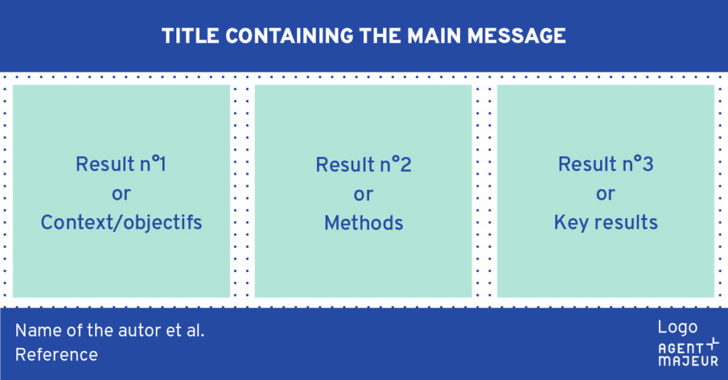
Template example to structure a graphical abstract
A balance between text and images
If your illustration includes too much text, it will put readers off. If on the contrary it does not include enough text, it will not be understood. Use short and precise sentences, only keep those that are pertinent. Do not hesitate to highlight key figures or key words from your study.
Moreover, do not fall into the opposite extreme by drowning readers with images. Make sure your find the right balance between written information and visual elements to create an attractive and self-standing graphical abstract.
The rules of graphic design
Mastering the rules of graphic designand composition is vital to create successful illustrations. Unfortunately, visual hierarchy and contrast are often underused in scientific illustrations. Ask yourself the following questions: “What are the most important elements? In which order must readers receive the information?” You will then be able to emphasize the key elements, those that need to stand out or to be seen first. You can increase or decrease the size of text or images, add contrasted colours and of course include shapes or symbols (arrows, numbers, icons) to guide the eye of your readers.
Your graphical abstract needs to comply with reading directions: from top to bottom and left to right. White space (or negative space) will also be vital to space out the content of your graphical abstract. Do not underestimate these empty areas which increase readability and help your readers to grasp the content. Beware of the size of elements, the graphical abstract needs to be legible even if the image appears in a reduced size.
Are you ready to take on this new challenge? It is well worth the effort: communicating the importance of your research with an attractive illustration can increase the reach of your work. And if for now, graphical abstracts are mainly submitted with scientific papers and shared on social networks, a graphical abstract can be used effectively in other contexts. Illustrating the chapter of a PhD thesis, adding value to a scientific poster, promoting research during a conference, supporting a funding request…the sky’s the limit. In the end, it is a new type of infographic used in scientific research.
> Written communication
05/05/2023